Stanford Swim Schools — Rebrand & Website
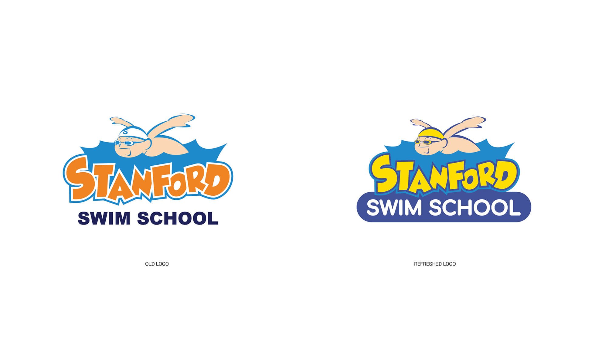
With over 20 years of teaching experience, Standford Swim School had a clear idea of what their updated branding and logo was to look like. They wanted to showcase their comprehensive swim programs to their customers, but in a fun way to reflect that at their core, the kids are their primary focus. Along with introducing a range of new colours, we updated all their icons and logos to reflect this new streamlined brand.


More about this project
Stanford Swim School, based in Hong Kong, approached me with a clear goal—to refresh their brand and website while maintaining the essence of what made their identity recognisable and trusted. As a well-established swim school with a loyal community, the challenge was to modernise without losing connection to their roots.
The rebrand began by refining their existing logo. Rather than reinventing it, we focused on enhancing its clarity and versatility across print and digital platforms. From there, I built a refreshed visual identity that reflected the school’s professional approach, community spirit, and commitment to helping children grow through swimming.
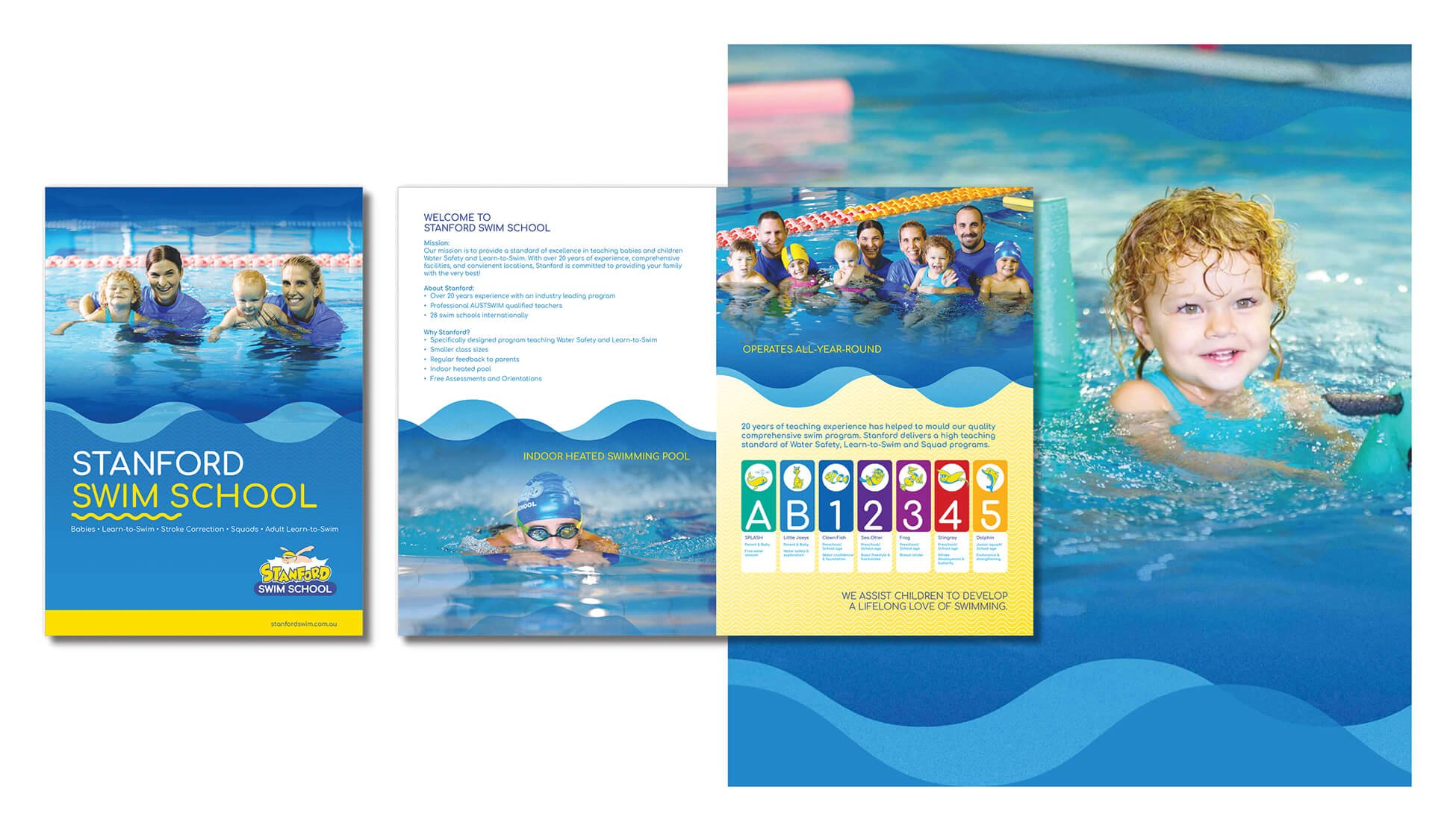
One of the key outcomes was the development of a new website, designed from the ground up. We created a bright, friendly, and easy-to-navigate platform that makes it simple for parents to find class information, learn about the program, and register online. The website was also built with future growth in mind, allowing the team to update content and expand functionality with ease.
The brand was rolled out beyond digital too—appearing across signage, uniforms, swim gear, and internal documents. Each element was designed to create a strong, unified look and feel, building confidence and trust at every customer touchpoint.
Working with a Hong Kong-based client brought added layers of collaboration, and we navigated time zones and workflows seamlessly to deliver a result the team was genuinely excited about. This project was all about blending evolution with consistency—creating a fresh, modern identity while honouring a brand that families already knew and loved.